The Publish Pro ribbons, along the top of the Publish Pro workspace, provide options for formatting and managing the appearance of your publication, and for accessing some advanced functionality. When you select different items on a page, options are included on ribbons that are relevant to the selected item, for example, you always see New on the Publication ribbon but only see font formatting options if a text box is selected and the Component ribbon is selected.
- For more general information about the workspace, see Publish Pro Workspace
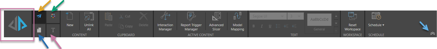
Opening Publish ribbons
Click the tabs to the top-left of the page to move between the different ribbons:
Run publication
Click Run Publication (purple highlight) or press your F2 key to open the Print & Export dialog and manually print your publication.
Ribbon selection
Due to the tremendous amount of flexibility provided by Publish Pro, the ribbon is split into four:
- Publish ribbon (orange arrow above).
- Design ribbon (green arrow).
- Page ribbon (blue arrow).
- Component ribbon (purple arrow). The content of this ribbon, and its icon, depends on which content item (text field, shape, visual, and so on) is selected on the canvas.
Maximize canvas space (collapse ribbon)
The overhead ribbons in the Pro app are expanded by default, but you can collapse them to give yourself some more canvas space. To collapse your ribbon, click the chevron at its right end (sky blue arrow). Once collapsed, you will need to hover over the repositioned buttons to access the options. To expand and pin the ribbon, click the chevron again.
Publish Ribbon
The Publication ribbon offers quick access to a range of commonly used tools, like clipboard functions, visual interactions, slicers, and scheduling.

|
Function |
Description |
|---|---|
|
Add a new page to your publication. Tip: You can also create a new page using the Add button at the top of the Pages panel. |
|
|
Unlink all sharable items and embed them as separate one-off instances in the publication. For example, unlink shared visuals so changes to the original in Discover no longer affect the copy in this publication. |
|
|
Access copy, paste, cut, and delete functions. |
|
|
Create interactions between slicers and the visuals, placeholders, and so on that they affect in your output publication. For example, create an interaction between a Country slicer and a Sales visual in Interaction Manager so that you can build a publication where the Sales visual shows details from the selected country only. |
|
|
Define conditions under which a publication, or selected pages within a publication, should be rendered and distributed; that is, the conditions under which the publish action should be "triggered." |
|
|
Build a new slicer using the New Slicer wizard. Note: When you create a slicer in this view, rather than from the "Quick" option in the Toolbox, you can configure all possible settings. |
|
|
Enable interactions between visual elements from different data models by creating a "mapping." |
|
|
Change the basic TEXT features for a selected text field, including font type, size, and headings. |
|
|
Reset Workspace |
If you move or minimize any of your workspace panels, click this button to reset the workspace back to its default layout. |
|
Create a new schedule or view any existing schedules for your publications. A schedule defines when your publication should be built and distributed, and provides details of the preferences (link backs, formats, and so on) that should be applied on build. This option is disabled until the publication is saved. |
Design Ribbon
The Design ribbon includes options that allow you to customize your publication, including layout tools (guidelines and grid settings), page setup, themes and formatting, and an AI image generator. It also includes options for controlling the appearance of your publication in edit mode (in Publish Pro).

|
Function |
Description |
|---|---|
|
Change the display size of the canvas when viewed in the app, relative to the available space. The options are: Fit to Page, Fit to Width, and Actual Size. |
|
|
Show or hide the rulers along the top and left of the canvas. |
|
|
Add guidelines to the canvas, to help you with the layout of the content items. These guidelines are vertical and horizontal lines that are shown when you are building your publication in Publish Pro but are not shown in the final publication. You can add a set of "preset" guidelines at the top, bottom, left, and right margins by selecting either Normal Preset or Narrow Preset. |
|
|
Grid* |
Show or hide the background grid. |
|
Enable or disable "snap to grid." Where this is enabled, new items snap to the grid lines when they are added to the canvas. You can also set the size of the grid in the dropdown list from this button. |
|
|
Select a preset page size for your publication from the dropdown list or select Custom to set a custom page size. |
|
|
Indicate whether the pages in your publication should use the portrait or landscape orientation. |
|
|
Choose a theme for your publication. Themes control the colors, fonts, masters, and so on associated with your publication; ensuring a consistent and professional look and feel. |
|
|
You can undo formatting changes in bulk using Reset Formatting on the Design ribbon or the Reset to Default Styles option in the Formatting panel. These options restore formatting to the selected theme or, for options that aren't theme-based, revert them to the default. |
|
|
Recreate the thumbnail images used for this publication in the Content Manager. |
|
|
Create AI-generated images in response to a text prompt. Note: The size of the image can either be standard or match the size of the canvas (for use as a background). |
|
|
Email only. Configure the tile size used for the grid. |
|
|
Show or hide error messages in the rendered publication. |
|
|
Toggle the dynamic text highlighting in Publish Pro. The two states allow you to view the content as your user will see it (without highlights) and use the highlights to quickly identify the dynamic content items for easy editing. |
|
|
Show an "empty" message when the dynamic text field's underlying data point is empty. |
|
|
Automatically translate dynamic text using Pyramid's AI-driven Auto Translate feature. |
* Document only. These options are only enabled where the publication's Output Type (set when creating your publication) is Document.
Page Ribbon
The Page ribbon offers a range of tools aimed at customizing the page that is currently open in Publish Pro.

|
Function |
Description |
|---|---|
|
New |
Add a new page to your publication. Tip: You can also create a new page using the Add button at the top of the Pages panel. |
|
Unlink all sharable items and embed them as separate one-off instances in the publication. For example, unlink shared visuals so changes to the originals in Discover no longer affect the copies in this publication. |
|
|
Page Canvas |
Change the color of the canvas using the Color Picker. |
|
The Page Repeater lets you render a single page multiple times, with each page filtered by a different slice value. This preserves a consistent layout, for example a Sales page with the same images and static text, while updating the visuals and generated content (placeholders, page insights, and so on) on each of the pages to reflect one of the selected slices. |
|
|
Page Triggers allow you to define conditions under which the Page Repeater should be applied. The result is that the Page Repeater filter is only applied for slices where a custom condition is met. |
|
|
Change the stacking order of the selected item, as layered on the canvas. (Send content items backwards and bring them forwards so that they are shown or hidden.) |
|
|
Align the object with the canvas or with another object on the canvas. |
|
|
Where three or more items are selected on the canvas, distribute those items vertically or horizontally relative to one another. |
Component Ribbon
The Component Ribbon offers settings and formatting choices that affect the look and feel of the currently selected item. As well as differing by selected item type, the options on the Component ribbon also differ depending on the visualization type of the selected visual.
Component ribbon examples
The following example shows the Component ribbon as it appears when a Text field is selected on the canvas:

 Component ribbon: Shape
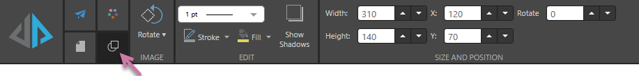
The Component ribbon where a shape is selected on the canvas:
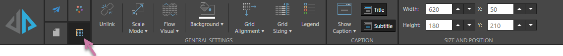
Component ribbon: Grid
The Component ribbon where a visual containing a Grid is selected on the canvas:
Note: To access these functions, select the Relevant Item on your slide.
|
Function |
Relevant Item |
Description |
|---|---|---|
|
Background |
Visuals (All), Tabulate visual area |
Change the background color of the selected visual using the Color Picker. |
|
Border thickness |
Shapes, Images |
Customize the Border thickness used by your shape, image, or illustration. |
|
Dynamic Text |
Access the copy, cut, and paste functions for the selected dynamic text. Note that these options apply to both the text itself and the underlying dynamic logic. |
|
|
Dynamic Text |
Click to open the Dynamic Text wizard and configure dynamic text for the selected text box. Use the dropdown list options to add dynamic text, dynamic placeholders, or text field variables to your selected text box. |
|
|
Fill color |
Shapes, Images |
Customize the Fill color used by your shape, image, or illustration using the Color Picker. |
|
Visuals (All) |
Allow large grids and vertically trellised charts to "flow" across multiple publication pages. Use the dropdown list option choose whether to show the header on every page or not. |
|
|
Text |
Change the text styling, including font type, size, color, emphasis, shadow, strike through, spacing, letter case, background color, text box border color, text box border width, and text background color. |
|
|
Text |
Toggles the selected text box between Graphic Text, which resizes automatically as you resize the text field, and Standard text, which must be resized manually. The dropdown list options also scale the Graphic Text. For example, select 2 from the dropdown list to double the size of the text in the selected graphic text box. |
|
|
Grid Alignment |
Grid, Tabulate visual area |
Align the grid within its container. For example, you might position it at the bottom-right corner of the panel. |
|
Grid |
Customize the layout of the columns in a grid by applying preset formatting options from the Grid Sizing dropdown list or by customizing the columns and rows in the Grid Size Setting dialog. |
|
|
Visuals (All) |
Show or hide the legend for the selected visual. |
|
|
Text |
Change the paragraph styling, including lists, indents, spacing, alignment, text direction, and columns. |
|
|
Rotate |
Shapes, Images |
Rotate by 45, 90, 180, or 270 degrees, or Reset to original rotation. |
|
Visuals (All), Tabulate visual area |
Change the scale of the selected visual. |
|
|
Visuals (All), Tabulate visual area |
Show or hide the panel that contains your selected visual and the visual's caption. The panel is the frame or border around your visual. Use More Panel Options on the dropdown list to edit the options in the Formatting Panel. |
|
|
Show Shadows |
Shapes |
Show or hide a Shadow beneath the shape. |
|
Size and Position |
Visuals (All), Tabulate visual area, Shapes, Text, Images |
Change the size and position of the selected item:
Tip: The X and Y coordinates and width and height are displayed underneath each content item when it is selected on the canvas. For shapes, text boxes, and images only, you can also Rotate the item by multiples of 10 degrees. |
|
Stroke color |
Shapes, Images |
Customize the Stroke color (the color of your shape's outline) used by your shape, image, or illustration. |
|
Text |
Apply a preset style to selected text. When you build your publication, text using a Heading style is typically included in the table of contents. If your publication is a PDF, the Heading styles also determine the hyperlinks included in the document outline. For more information, see Table of Contents in Publish Pro. |
|
|
Visuals (All), Tabulate visual area |
Show or hide the subtitles for your selected visual. Note: Subtitles are typically breadcrumb trails but can be replaced with a custom value. |
|
|
Visuals (All), Tabulate visual area |
Show or hide the titles for your selected visual. |
|
|
Visuals (All) |
Unlink the selected content item and embed it as a separate one-off instance in the publication. For example, unlink a shared visual so changes to the same visual in, say, Discover no longer affect the copy in this publication. |